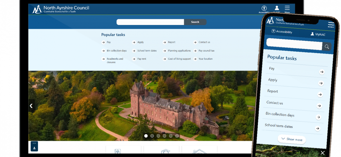
IT services have developed a customisable accessibility tool on the public website that will enable everyone to access council services more easily. This tool launches on 5 August 2025.
When testing throughout our local communities, feedback highlighted that this tool would be helpful in building the public’s digital confidence with the current move to digital and technological improvements in public services.
Throughout development we tested with just over 100 people from a variety of demographics and 58% experienced an accessibility need. We hope the accessibility tool provides tailored help for specific needs and provides digital support to North Ayrshire citizens when using our website.
North Ayrshire has a diverse population, and our tool works with Google translate so it saves time and money reducing the need for paid translation.
Our read aloud option has many benefits. It uses text to speech technology to convert written content into audio helping visually impaired users or anyone with a learning disability, and for anyone who simply prefers listening to information.
The option to resize font supports both visually and cognitively impaired users by making text larger and more readable, a useful tool for everyone.
As our website already uses a sans-serif font which is industry standard for readability, we wanted to go a step further by offering an Open Dyslexic font, which provides additional help for some who struggle with common letter confusion while reading. The font character has a heavier weighted style, unique shape and more letterspacings. These features help users by reducing reading errors and improving speed by decreasing eye strain.
Your device’s browser will automatically remember the settings which are personalised when you close and open the website again.
Using high contrast mode simplifies website colours, making text, links, and interactive elements clearer. This option helps any individual who experiences colour vision deficiency and improves reading experience and usability of the website. In addition, using high contrast colour is often the preference of people with low vision and those that are overwhelmed by bright web pages.
Our custom colours default option increases visibility for some forms of dyslexia, using pastel backgrounds with dark blue text. These colours soften pages whilst keeping a high contrast ratio. The custom colour setting offers colour customisation choice allowing anyone to choose colours that work best for their individual needs. For full information on how to use the tool and where digital support sessions will be held visit our accessibility tool support video page.